The world of colour has always been a fascinating universe and an essential component of many areas of artistic and productive expression. The search for a colour cataloguing system that ensures precision and clarity has always been an objective of primary importance, achieved by various entities, with some important results. Among the main ones is the Natural Color System, abbreviated to the acronym NCS.
How was the NCS System born? How is it structured and how does it work, as opposed to the Pantone System? Let’s find out together.
The history of NCS
The formulation of the Natural Color System (NCS) has its roots in the theory of chromatic opposition postulated for the first time in 1915 by German physiologist Ewald Hering, together with the observations of the American painter Albert Henry Munsell.
The most complete version of the NCS was then developed by the Swedish Colour Center Foundation in the second half of the 1960s, at the hands of the research group composed of Anders Hård, Lars Sivik and Gunnar Tonnquist. It is a unique colour cataloguing system, based exclusively on the human perception of chromatic shades and not on their mixing.
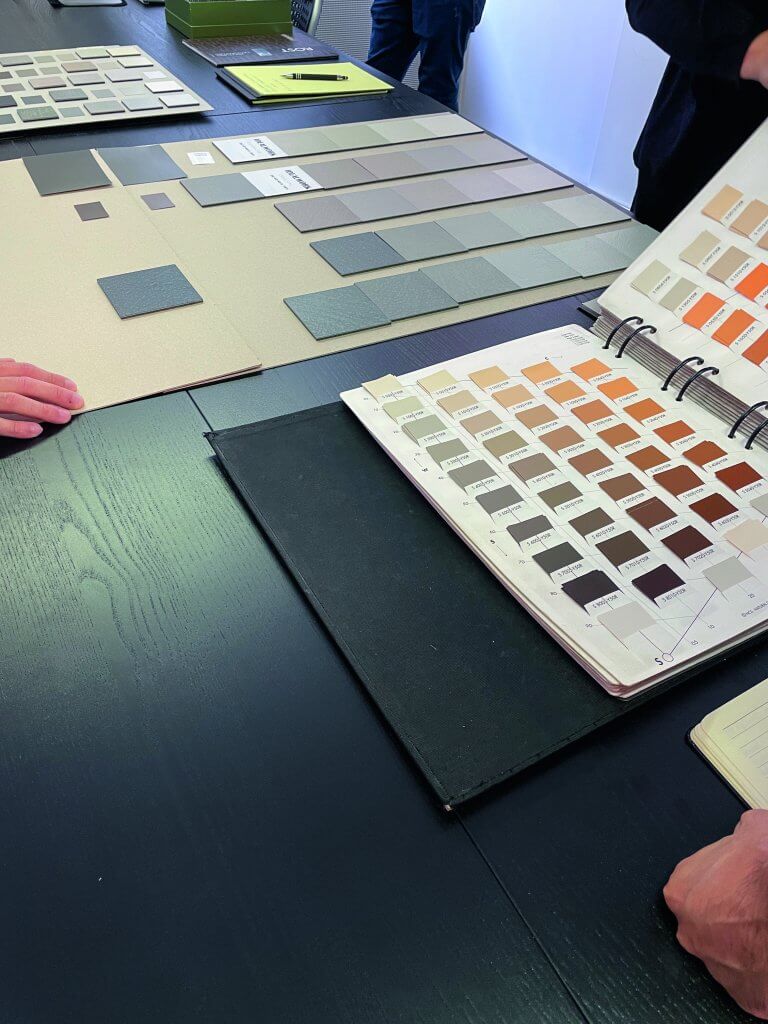
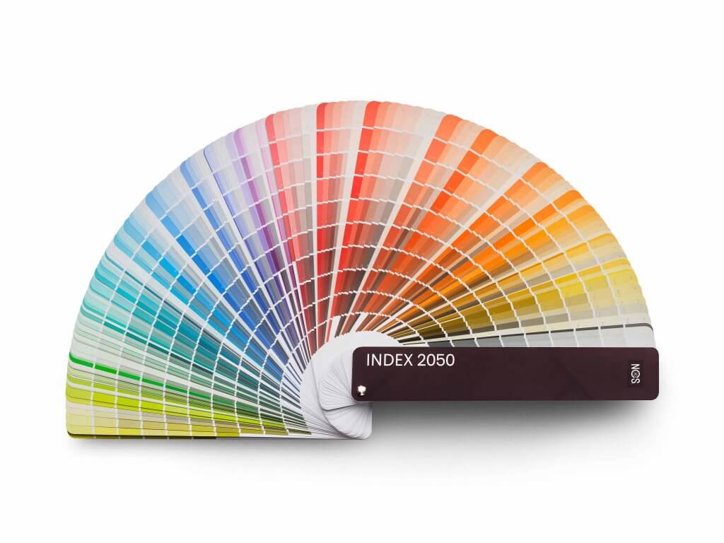
Today the NCS is owned by the Stockholm company NCS Color AB and is based on an NCS Color Atlas, which codifies the 1950 official shades of the entire system.
How NCS works
The NCS color system offers a solid and reliable basis for exploring and understanding the world of colours. Its versatility ensures that its use does not rely to the material to which the colours will be applied and, for this reason, its functionality covers a wide range of industries and applications.
But how does the NCS System work?
The most important thing to know is that NCS is structured around six elementary colours – white (W), black (S), yellow (Y), red (R), blue (B) and green (G) – and describes each shade depending on its similarity to the six elementary ones.
The six primary colours are graphically arranged in a three-dimensional model called “NCS color space“, within which all 1950 NCS colours are located.
This space is made up of two two-dimensional models:
– The NCS Color Circle: a horizontal section in which 4 primary colors (yellow, red, blue and green) are positioned at the 4 cardinal points
– The NCS Color Triangle: a vertical section, where the grey scale (from black to white) is expressed at the base and the summit represents the point of maximum saturation
NCS colours: NCS notation
Based on its location within the NCS Color Space, each individual shade is defined by an identification code called NCS Notation. Only the NCS Notation can immediately give an idea of colour to those who know how the Natural Color System works.
Let’s see an example with the NCS S 6010-G90Y colour:
– 60 describes how much black is present in that colour on a scale of 100 (the higher the number, the closer it is to black; the lower the number, the closer it is to white)
– 10 describes the degree of saturation on a scale of 100 (the higher the number, the closer it is to saturated colour; the lower the number the closer it is to neutral grey tones)
– G90Y describes which primary colours are present on a scale of 100 (in this colour there is 90% “G” or green and 10% “Y” or yellow)
This case is a pastel colour, with an overall perception of a shade between sage green and grey.
Differences between NCS and Pantone
Like the Pantone System (which we have seen in our previous article), the NCS System is a universal method for identifying and communicating colours univocally and specifically. But what are the differences between these two colour coding systems?
Because of its cataloguing principle based on the human perception of colours, the NCS is more suitable for use in the field of wall paintings, as well as textile dyes. The PMS, on the other hand, catalogues its colours according to a specific colour formula, so it is more commonly used in commercial printing projects, where exact colour matching is necessary.