How a space feels and looks influences our well-being.
To give each space the right perception, an analysis of the target group and the precise functions of the various spaces in the building is required.
This results in the correct appearance and professional design of the spaces so that the users can function optimally and positively.
This results in the correct appearance and professional design of the spaces so that the users can function optimally and positively.
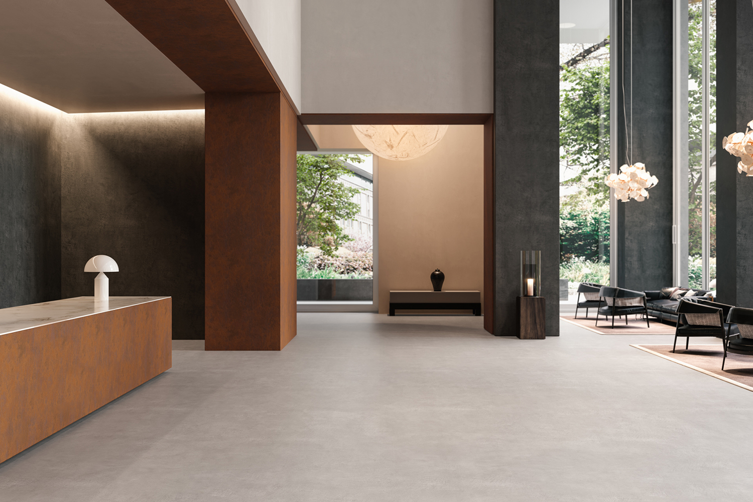
How people experience the atmosphere in an environment depends on various factors.
The quality of light, the climate, the way floors and walls reflect the light and their tactile nature, the acoustics, the influence of the colours and even the smell someone notices when entering a room or building. A total study of the listed factors is necessary to create the desired atmosphere and experience.
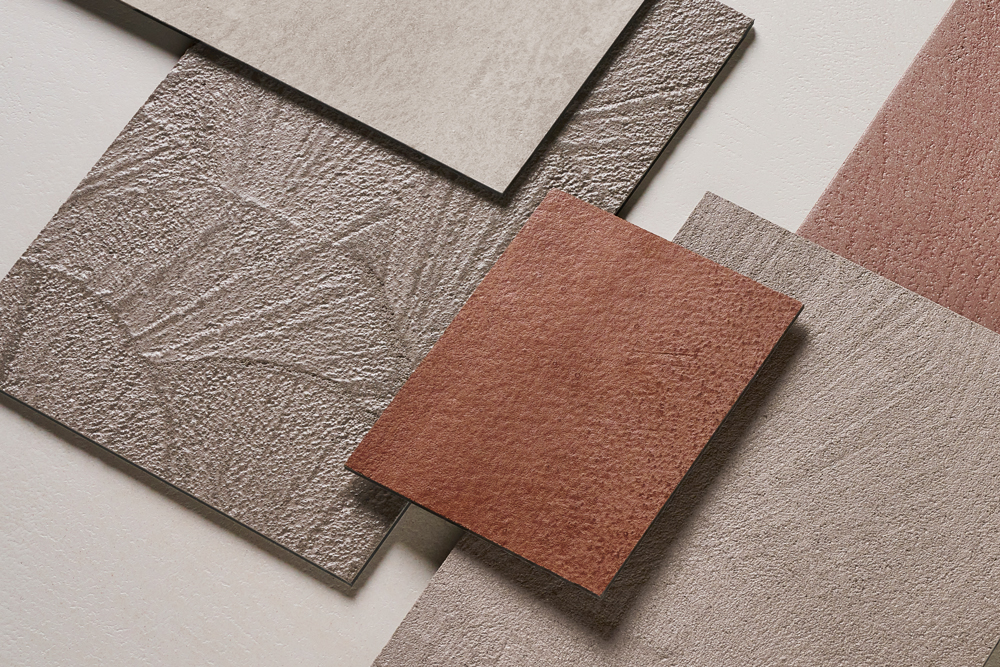
Material, texture and colour
The power of material and colour
is still too often underestimated. Professional use of colour is an
ideal method to emphasise positive experiences, mitigating negative experiences.
A well thought out and substantiated colour plan is therefore an integral part of setting the atmosphere in a space, with a view to even greater well-being for the people who stay, work or visit.
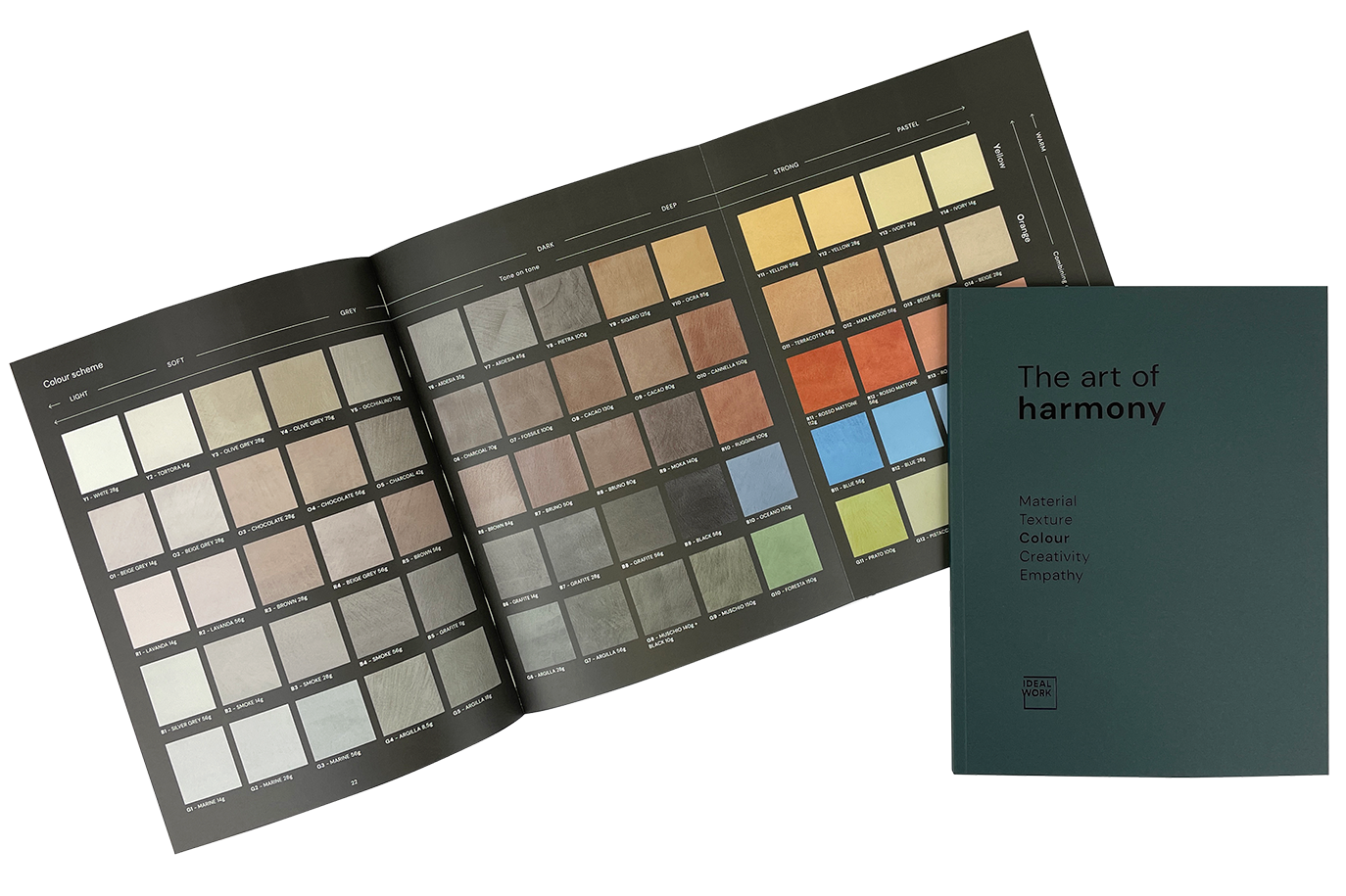
The new colour system
We arranged five colour ranges which served as a kind of matrix to classify all materials.
In this new concept, each colour range starts from light and soft shades, through grey and dark tones, to intense colours, ending with pastel nuances.
How to read the colour scheme
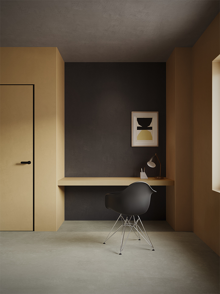
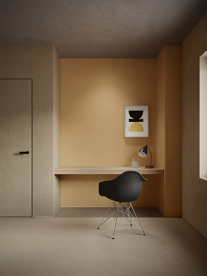
The colour scheme is designed in such a way that horizontally perfect tone-on-tone combinations can be created within one colour range, both with soft and strong contrasts. Vertically, one is inspired to combine several colours that have the same colour strength. This can lead to highly trending results.
The art of combining
You always end up with perfect harmony in both directions.
The new colour system
We arranged five colour ranges which served as a kind of matrix to classify all materials.
In this new concept, each colour range starts from light and soft shades, through grey and dark tones, to intense colours, ending with pastel nuances.
How to read the colour scheme
The colour scheme is designed in such a way that horizontally perfect tone-on-tone combinations can be created within one colour range, both with soft and strong contrasts. Vertically, one is inspired to combine several colours that have the same colour strength. This can lead to highly trending results.
The art of combining
You always end up with perfect harmony in both directions.
How to read the colour name
MF-y3 - olive grey 28g
M
Product line: Microtopping
F
Finish: Finish Coat
Y
Yellow line
3
Number of the colour within the product line
olive grey
Color Pack-C name
28G
Amount of Colour Pack-C needed for 1 L of Microtopping Polymer.
The five colour ranges
A number of important results emerged from all previous studies and research, creating overview, order and structure across all collections. This resulted in five colour ranges which served as a kind of matrix to classify all materials. This structured overview in this new material and colour concept stimulates and inspires the creation of combinations within a single collection or to shape an aesthetic harmony between different collections.