In the vast field of graphics and design, the Pantone System represents an indispensable resource for professionals and creatives from all over the world. In this article, we will explore the Pantone System through its history, its uses and functioning, its applications and its importance in the world of design.
Pantone System: history
The Pantone System, also known as Pantone Matching System (PMS), was created by Lawrence Herbert in 1963. Herbert was a young employee of a printing company, and as soon as he realised how difficult it was to obtain effective results in colour printing, he was driven to create a standardised colour system. Such system has become a cornerstone in the world of graphic design and printing, allowing professionals to communicate clearly and precisely about desired colours.
Pantone System: what is it?
The Pantone System came to represent a real revolution in the field of design and production, as it offered a reliable and universal way to select and consistently reproduce definite colors all over the world.
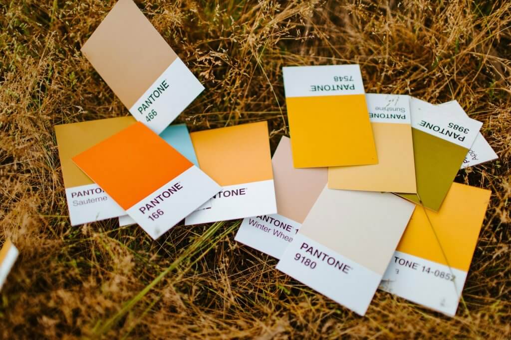
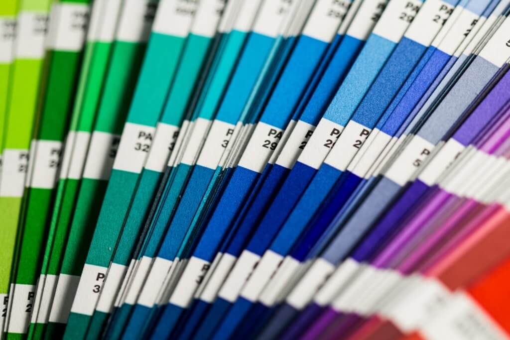
Pantone, whose name is made of “pan” plus “tone”, meaning “all colors”, has developed a system for cataloguing and identifying more than 10,000 types of colours.
The Pantone System introduced proprietary numbering and colour cards that allow designers to see exactly how each colour appears on paper or other media.
Today Pantone is a leading authority in the colour industry, setting global standards in graphics, and industrial and chemical colour management.
Pantone System: how does it work?
The Pantone System assigns a unique PMS number to each colour, which allows for precise matching. This number is made up of a sequence of digits followed by the letters U, C or M, which indicate the type of paper on which the colour will be printed: “uncoated”, “coated” or “matte”. The choice of print medium is crucial, since even the same colour can vary slightly on different surfaces, for example on a wall or glass. To face this challenge, Pantone offers two sets of PMS colours: coated and uncoated, which use the same ink but behave differently depending on the type of paper.
Each Pantone code is also defined by a sequence of 6 digits, where each pair of numbers has a precise meaning. For example, for Pantone 16-1546:
– 16 refers to how light or dark the colour is
– 15 specifies the shade it belongs to: yellow, red, blue or green
– 46 describes the colour’s chroma level (i.e., the colour’s purity level)
Pantone System: applications
The Pantone System has a wide range of applications that make it essential in a number of different creative and industrial sectors:
– Printing
– Packaging
– Industrial design
– Interior design
– Fashion
For this reason, Pantone has developed two colour systems, each specifically designed to match a target market: the proper “Pantone Matching System (PMS)” and the “Pantone Fashion, Home + Interiors (FHI)“. Each type of colour systems is aimed at different needs and takes into consideration the colour rendering on different types of materials and with different colouring substances.
Pantone: colours and trends
Pantone has a profound influence on the world of design and fashion. The Pantone Colour Institute, within the company, plays a key role in predicting global colour trends. Every year, through in-depth studies and analysis of fashion trends, it elects the “Pantone colour of the year” — Viva Magenta was elected for 2023. Colour trends drive fashion and contemporary aesthetics, inspiring a vast range of design objects, graphic experiments and couture.
The Pantone Colour Institute also provides advice to companies on the strategic use of colour in brand image and in the creation of products, since the emotional and psychological strength of colours contributes to shaping the perception of a brand.
To find out more on Pantone colours, take a look at the Pantone’s official website!