Designer Moodboards: A Journey Through Materials and Inspiration
THE MOODBOARD SERIES #5
Japan: The Balance of Contrasts
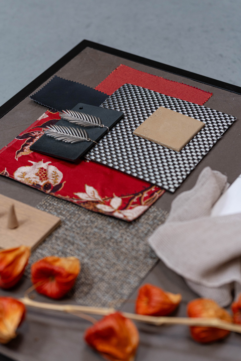
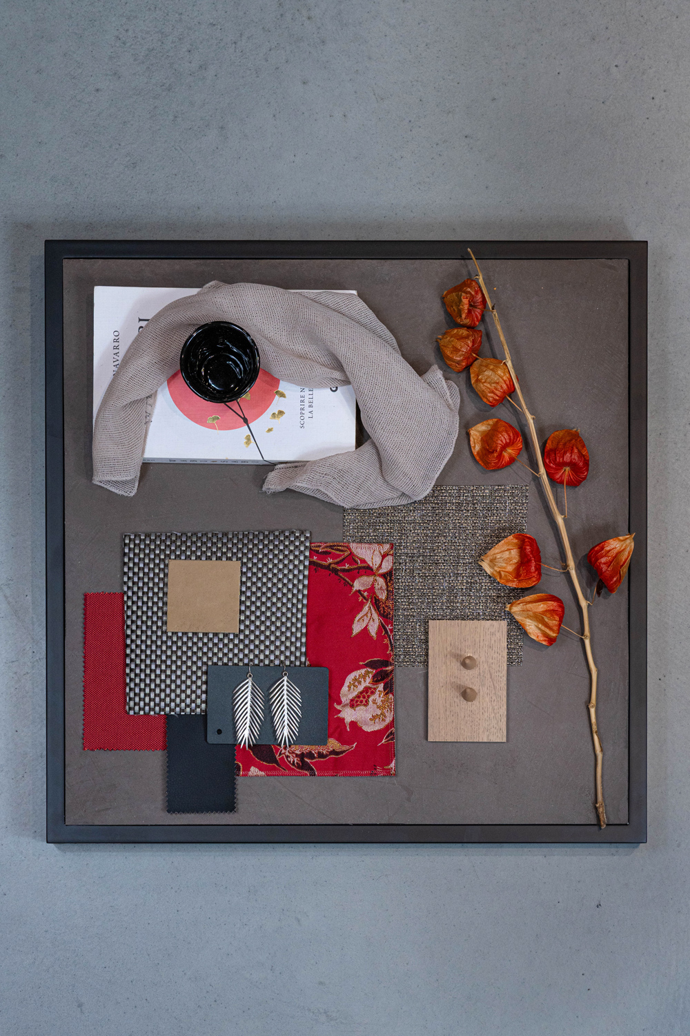
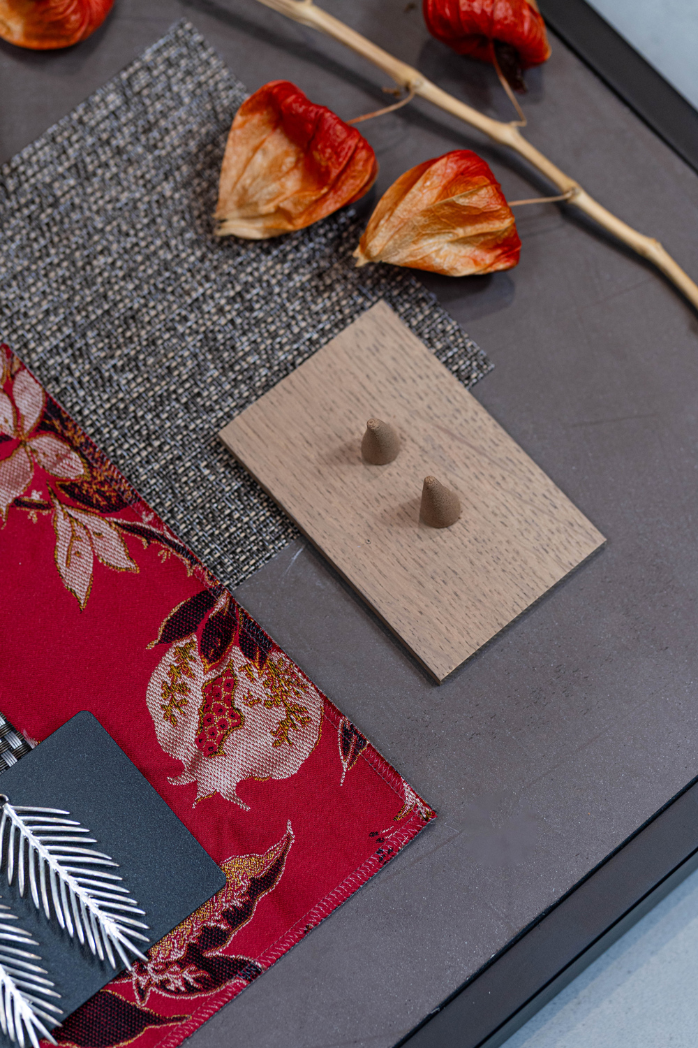
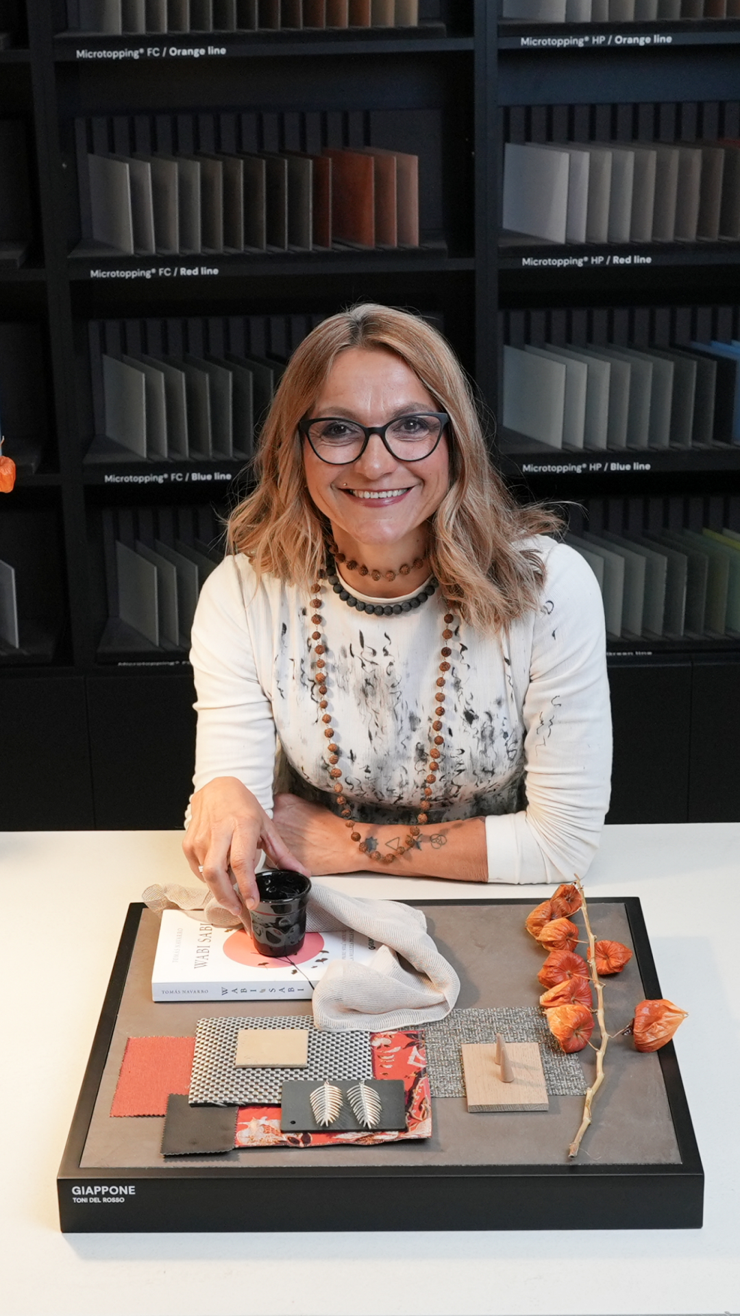
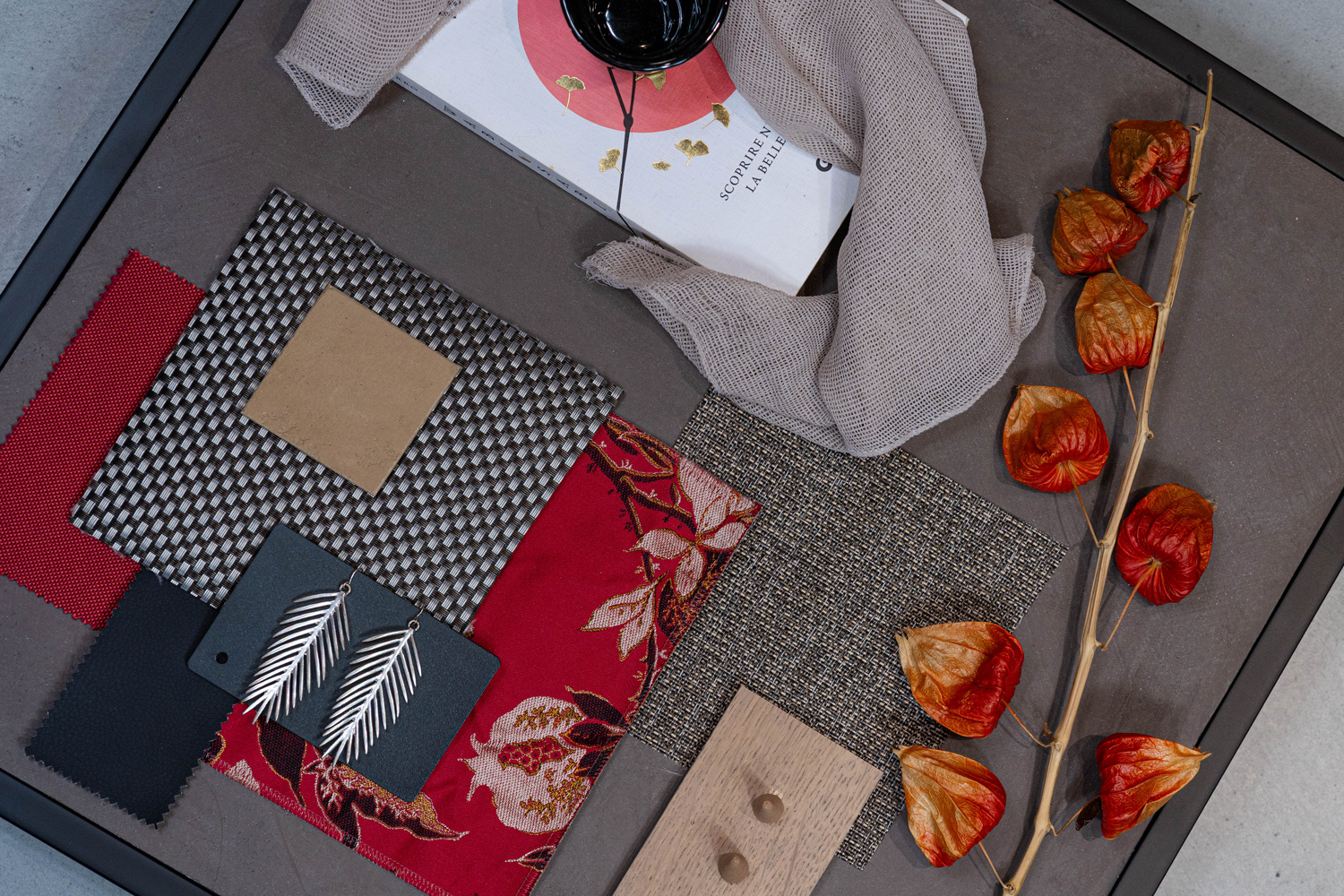
The fifth moodboard takes us to Japan, where colour and symbolism intertwine in an aesthetic defined by balance and contrast. Red, a symbol of energy and sacredness, appears in torii gates and the precious silks of traditional kimonos, standing out boldly within a visual culture where every element has its place.
The composition emerges from the encounter between this chromatic intensity and the restraint of Zen aesthetics. Neutral backgrounds, essential lines and red accents create a palette in which energy and tranquillity coexist, striking a balance between visual silence and a strong personality. An essential language that still leaves a lasting impression.
To interpret this atmosphere, Microtopping® was chosen: a seamless surface capable of covering shapes and volumes like a second skin, creating fluid spaces without visual interruptions. The continuity of the surface enhances the purity of the forms, while colour defines the space, transforming contrast into a true design element.